So, here's the email I had waiting for me this morning:
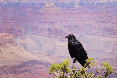
OK... I think your wife might have been right. That mirror photo does nothing for me at all. There's too much extraneous stuff that adds nothing to the photo. I prefer simplicity of design. I love the crow but I would
have cropped it and done some other stuff to it. See attachment. I like
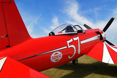
the B&W photo. It's too bad that door is open... that detracts, but I know you couldn't do anything about that. It's still good. I like the red plane the best of all... with a few little edits.
The edits he made will be readily apparent:
Before:

After:

Before:

After:

That's why he's a professional and I'm a hobbyist, I guess. I'm motivated to learn, though! I'm always amazed at the difference the editing makes, and I really need to take the time to learn how the use the tools more fully.
Here's the email I replied with:
Thanks for taking a look!
Ah, you got rid of that damn foot (and flag, and tail of other airplane, and...)! I haven't the "mad skillz" (as my daughter would say) to do that. Awesome! I swore that as soon as OJ and I found the real killer, my next quest was to find the owner of that foot! Frankly, if it hadn't been for the foot, I would have entered that one. I already have it framed and ready to go. In fact, it's hanging right here in my office.
Registration is still open - I wonder if they'd let me switch... I'd have to leave the foot and stuff in it, though, as a matter of personal ethics. Nah, there's always next year. I'm also kind of big on living with the consequences of my decisions, and it would give me time to learn how to edit stuff like that out by myself. I assuming GIMP would be sufficient with enough effort.
The wife will be (or would be, if I was actually going to tell her!) pleased to learn that you agree on the mirror picture. Maybe I'll save that comment and give it to her for her birthday. That diamond ring she got last year is going to be hard to top.
I did tell the wife, as it turns out. She was far more gracious about it than I would have been. She's still not getting another diamond, though! Maybe a Caribbean vacation...

I can't tell the difference between the before and after on the airplane, Dave.
ReplyDeleteHowever, I am reminded of an article --somewhere (AOPA?) -- about photographing airplanes that basically said don't try to cram the whole airplane into the picture, especially if there's a person in there; that people know what an airplane looks like so if there are enough lines on the plane in the picture to suggest the dimension and track of those lines in a cropped-out section, that suffices, and allows you to enhance, say, a person.
One thing I'm trying to get my arms around -- photography wise -- is the "rule of 1/3." As it has been explained to me -- and I can't remember by whom -- you compose your picture in 1/3s of the screen, quite often moving your subject to center in one of the "thirds" rather than in the center of the frame.
I'm still waiting to try that. So far my picture of an under-construction RV-7A canopy has proven the rule one way or the other.
You have to look at the bigger versions. Rick removed the feet and concrete under the fuselage, and the tent tops and flag up by the prop. They're far more evident on the big enlargement that I printed and framed.
ReplyDeleteI agree on cropping planes tightly, and have tried to do that with most of my airplane pictures. It helps a lot when when you just can't get a clean shot - you know, like at Oshkosh! I like very close detail shots too - while I was at OSH I took a lot of shots of engine and prop badges (Lycoming, Continental, etc.)
I think Rick perfectly exhibited the 1/3 rule with the Raven/Crow/Big Black Bird. I cropped it right in the center, while Rick moved it down into the lower right quad. I chose to leave it in the center like I did because I really like the detail of the tree, but I like Rick's version too.
An example of a picture where I had to crop very closely is the Blue Corsair in the post below this one. They were working on the engine, so there were people everywhere. I managed to get most of them out of the picture by cropping it very tightly, and I think I got a better picture that way anyway.
ReplyDeleteDaveG - came to you thru my own blog - Reflections by Kris. Thank you for your comment today (9/28).
ReplyDeleteAs a semi-professional photographer myself, I agree with the crop of the black bird.
Rule of thirds is indispensible for photographers. Carve up your visual field into horizontal and vertical thirds - then stay away from the middle "box" unless it's a sunset and you are shooting into the sun (even then try to keep the horizon line in the bottom horizontal third). Place the most prominent part of the image into any of the surrounding boxes, depending on the background and subject, orientation of object, etc. You can't go wrong with composition following the Rule of Thirds. I learned it from a National Geographic photographer and it's stood me in good stead for nearly 10 years now.
I still struggle with the whole cropping thing - digital makes it so easy to fix mistakes. I'm more of a purest, but sometimes excitement gets the better of all of us.